Theme Editor
The theme editor allows someone to change the styles of a website without needing a developer. Go to Design -> Theme Editor in the administration.
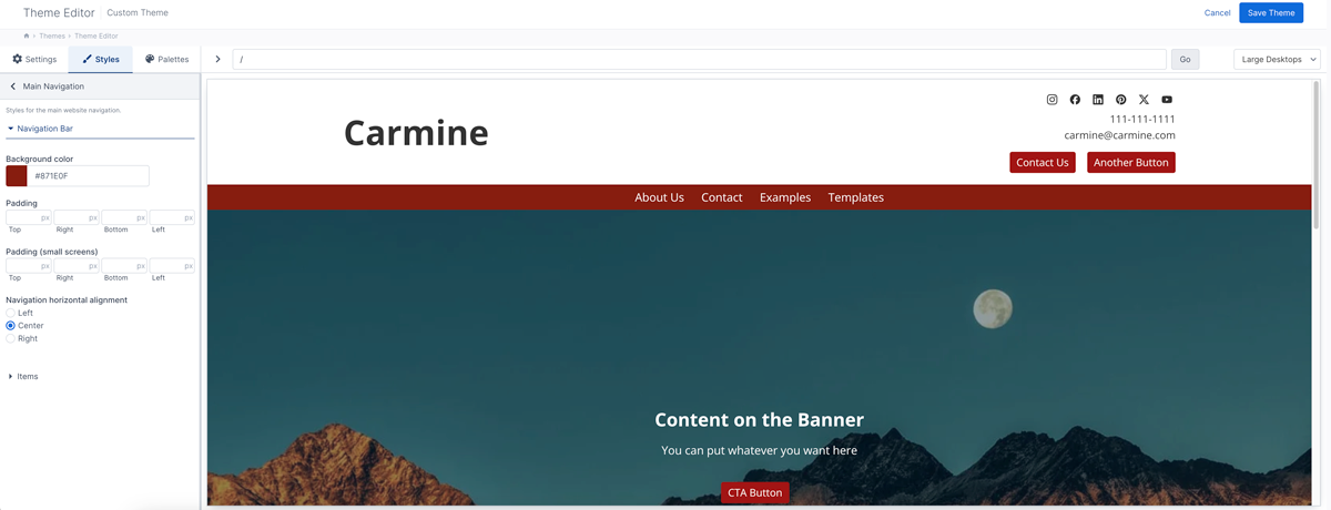
Some example uses of the theme editor include:
- Allow someone to edit the fonts and typography of their website.
- Enable someone to edit colors for different sections of the website.
- Editing other styles for elements.
- Allow website owners to upload their own logo or configure the design.
- Enable editors to manage content in the header and footer that is usually hard-coded in HTML.
- Allow customers to add their own social networking links.
- Turn on or off certain UI elements.
- Configure custom logic for apps or pages.
As the website designer/developer, you have full control over the fields and how they are organized.
The biggest difference between the Aptuitiv theme editor and other website builders is that the developer controls what styles or settings are available. By default nothing is editable. You set up and organize the settings and styles that you want to expose.
Configuration files
The configuration for the theme editor is done with JSON files. When the theme settings page loads in the administration it loads the JSON file and uses that to output the necessary fields. There are three configuration files and they are located in the config folder within the theme folder.
If you are using an Aptuitiv-designed theme them the theme configuration files are located in the src/config folder.
It is very important that you ensure that the JSON in the files are valid JSON otherwise the theme editor will not behave as expected and you could have some data loss.
If you change the theme settings or styles make sure that you refresh the theme editor page after uploading the changed JSON files. Do not save the data in the theme editor until you've refreshed the page first. If you caused the JSON to be invalid, then the existing settings can be cleared out. This is because the system doesn't think that there are any fields because the JSON is valid. Always refresh the admin theme editor page after uploading a changed JSON file and make sure that the fields are correctly showing before saving. (None will show if you broke the JSON.) Some examples of invalid JSON are using single quotes instead of double quotes, trailing commas or not using commas.
The configuration files are:
- config/theme-config.json - This sets the overall configuration for the theme editor such as the screen sizes or enabling/disabling the theme editor.
- config/theme-settings.json - The theme settings fields that show under the Settings tab in the theme editor.
- src/config/theme-styles.json - The theme style fields that show under the Styles tab in the theme editor.
You do not have to use both the theme-settings.json and the theme-styles.json files. You do, however, have to use at least one of them. If there is no theme-settings.json file, the file is empty, or it contains invalid JSON, then the Settings tab will not show. Likewise, if there is no theme-styles.json file, the file is empty, or it contains invalid JSON, then the Styles tab will not show.
Theme editor tabs
Theme editor fields are organized under two tabs:
- Settings
- Styles
There is no functional difference between the fields under the Settings tab or the Styles tab. The only purpose is to provide some organization between fields that are for content or configuration and those that are for styling and display.
The "Settings" fields are intended for configuration or content. This could include fields for:
- Logos
- Social media links
- How content should be displayed
- Content
The "Styles" fields are intended for fields that control CSS styles and they often generate inline CSS that will be included on pages. This could include fields for:
- Typography styles
- Colors
- Padding
- Page width
- Button styles
A third tab that can show is the "Palettes" tab. This is where the color and font palettes are managed. You cannot set fields to show under this tab. You can only enable or disable the color or font palettes. By default they are enabled. If you disable both the color and font palettes then the "Palettes" tab will not show.
Organizing fields
Within the Settings or Styles tabs you can organize fields into groups or simply list the fields.
Top-level groups display as a button that once clicked will hide the other content in the panel and show the content within that group.
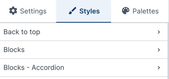
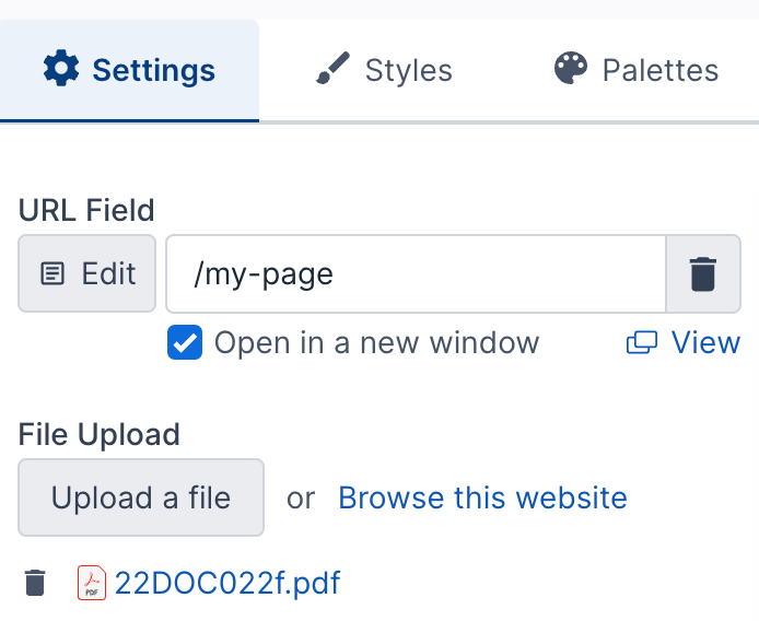
You do not have to use groups to organize fields. You can simply display the fields under the Settings or Styles tab. In that case, in the theme-styles.json or theme-settings.json file, use the fields value to organize fields.
{
    "fields": [
        {
            "name": "urlField",
            "label": "URL Field",
            "type": "url",
        },
        {
            "name": "fileField",
            "label": "File Upload",
            "type": "file",
        }
    ]
}
That will output something like this:
Field groups
If you have a lot of fields then groups are a good way to organize them.
A top-level group can contain fields, sub groups, or sections. It can only be one or the other.
If a top-level group contains sub groups then all fields have to be in a sub group. A group with sub groups cannot contain sections.
A sub-group cannot have more sub groups. There can only be two levels of groups.
If a group contains sections then all fields have to be in a section. A group with sections cannot also contain sub groups or sub sections.
If a group contains sub groups then those sub groups are displayed as accordions.
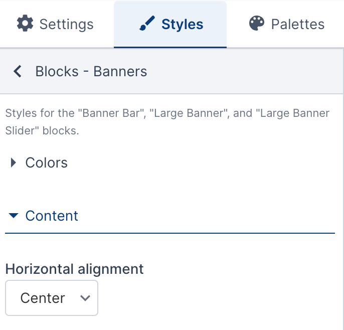
If a group contains sections then those sections are displayed as headings.
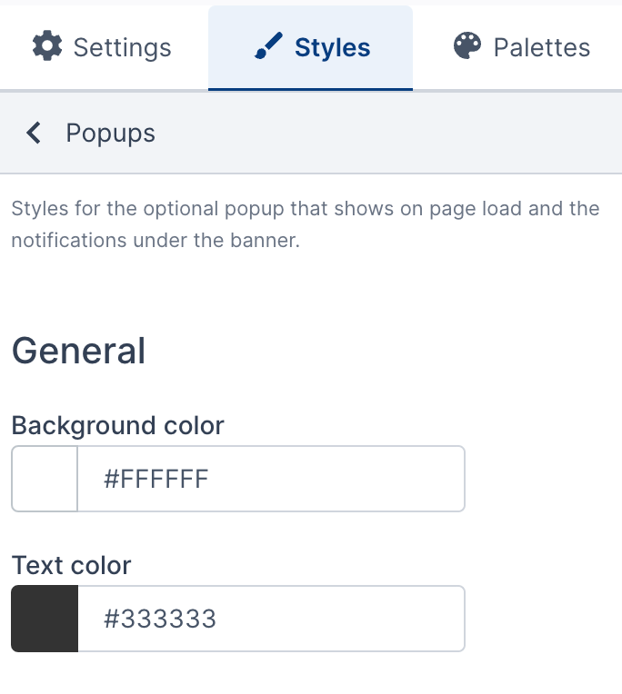
Here is an example of groups with fields.
{
    "groups": [
        {
            "name": "Group name",
            "fields": [
                {
                    "name": "url",
                    "label": "URL Field",
                    "type": "url"
                },
                {
                    "name": "file_upload",
                    "label": "File Upload",
                    "description": "file upload description",
                    "type": "file",
                    "path": "docs/theme-test"
                }
            ]
        },
        {
            "name": "Another group",
            "description": "Group description here",
            "fields": [
                {
                    "name": "textField",
                    "label": "Some text field",
                    "type": "text"
                }
            ]
        }
    ]
}
Here is an example of groups with sub groups.
{
    "groups": [
        {
            "name": "Typography",
            "description": "Typography styles for the website",
            "groups": [
                {
                    "name": "Body",
                    "fields": [
                        {
                            "name": "bodyColor",
                            "label": "Body font color",
                            "type": "color"
                        },
                        {
                            "name": "bodyFontSize",
                            "label": "Body font size",
                            "type": "fontSize"
                        }
                    ]
                }
            ]
        }
    ]
}
Here is an example of groups with sections.
{
    "groups": [
        {
            "name": "Service Notifications",
            "description": "Section description here",
            "sections": [
                {
                    "name": "Trash service",
                    "fields": [
                        {
                            "name": "trash",
                            "label": "Trash",
                            "type": "select",
                            "options": {
                                "Automatic": "Automatic",
                                "On schedule": "On schedule",
                                "On schedule: Starts at 6am": "On schedule: Starts at 6am",
                                "Delayed one day": "Delayed one day",
                                "Delayed one day starting": "Delayed one day starting",
                                "Trash overflow week": "Trash overflow week",
                                "Not today due to weather": "Not today due to weather"
                            },
                            "description": "If 'Automatic' is selected then the Holidays below will be used to determine the correct value to show."
                        },
                        {
                            "name": "dayThatTrashDelayStartsOn",
                            "label": "Day that trash delay starts on",
                            "type": "text",
                            "description": "Used if the Trash field is 'Delayed One Day starting'"
                        }
                    ]
                }
            ]
        }
    ]
}
Setting the width of the sidebar
The sidebar where the fields are located is usually at the smallest width. An editor can click and drag the vertical line separating the fields from the preview to make the field width wider or narrower.
You can also set a pre-defined size for the sidebar.
Some field types like repeating fields, or repeating grids are more usable with a wider sidebar. By default, if it's detected that a repeating or repeating grid field is going to be displayed in a group, then the sidebar is automatically wider.
There are three four sidebar widths.
- small - this is the default size
- medium
- large
- full - full width
You can set the sidebar width with the sidebarSize value in a group configuration. If a sidebar size is set then the sidebar will not automatically resize if a repeating or repeating grid field is in the group.
{
  "name": "Group 3",
  "description": "",
  "sidebarSize": "large",
  "fields": []
}